Image Generation Evals
Use Case Ideas: UI mockups, marketing graphics/posters
Goal: evaluate text-to-image quality, controllability, and usefulness for real prompts
Covers:
- instruction following (constraints satisfied),
- Text rendering (generated text is accurate, legible, and placed correctly),
- Styling (requested aesthetic + visual quality, may include brand, character, and product consistency)
- Human feedback alignment (rubric-based labels + pairwise prefs).
Image generation models are used to create artifacts that influence real work: UI mockups, product designs, marketing graphics, and internal presentations. In these contexts, images are not judged purely on visual appeal. They are judged on whether they communicate intent, follow constraints, and are usable by downstream stakeholders.
UI Mockups
UI mockups generated by image models are increasingly used for early product exploration, design ideation, and internal reviews. In these workflows, mockups are not just visual inspiration. They are communication tools that help designers, engineers, and stakeholders reason about layout, hierarchy, interaction intent, and feature scope before anything is built. As a result, success is defined less by aesthetic taste and more by whether the output can plausibly function as a product artifact.
Example:
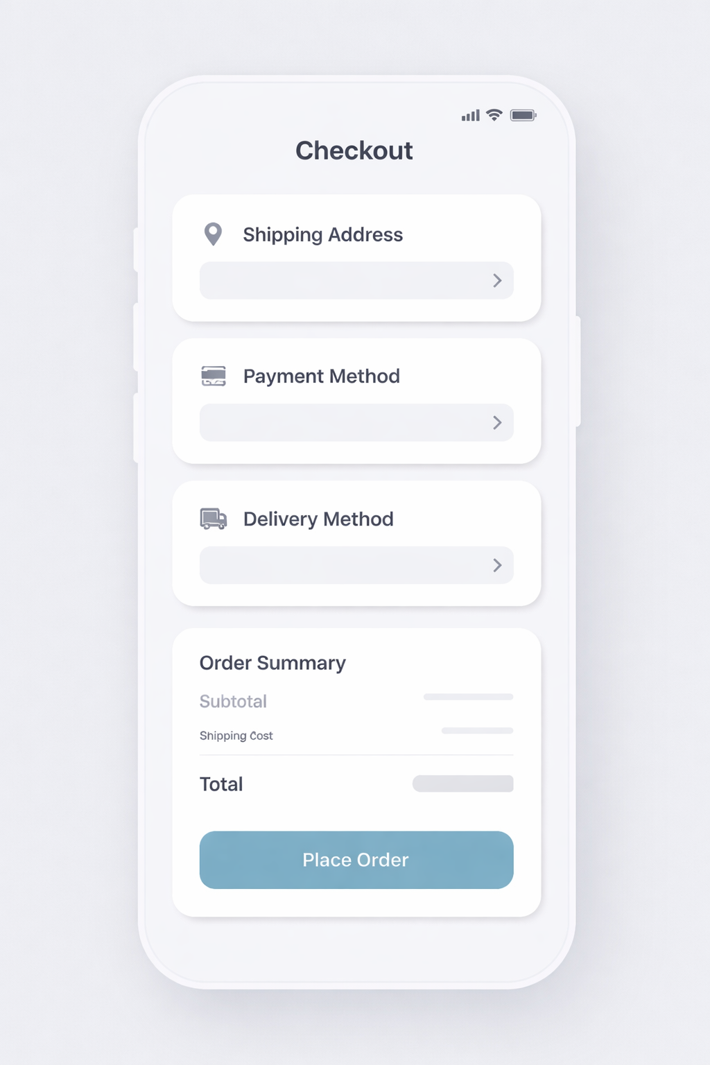
This section shows how to evaluate a generated UI mockup using a screen level example. The goal is to evaluate whether the generated UI consists of a coherent layout, uses recognizable components, and represents a plausible product experience.
Why UI mockup evals are different
UI mockups combine several difficult evaluation dimensions:
- Component Fidelity (gating)
The generated image must clearly depict the requested screen type and state. Buttons should look clickable, inputs should look editable, and navigation should look like navigation. - Layout Realization (graded)
A good UI mockup communicates instantly what the user can do and what matters most. The layout should make primary actions obvious, secondary actions clearly subordinate, and information grouped in a way that reflects real interaction flow - In-Image Text Rendering (gating)
UI text encodes functionality. Labels, headings, and calls to action must be legible and correctly rendered.
Example task: mobile checkout screen generation
- Scenario: a consumer ecommerce app needs a mobile checkout screen to review an order and complete payment.
- Prompt guidance: be explicit about screen type, platform, required UI elements, exact button/link text, hierarchy constraints, and disallowed extras.
- Implementation: the full prompt and criteria live in the harness setup code cell below (
ui_promptandui_criteria).
What to evaluate (practical metrics):
1) Instruction Following — Pass / Fail (gate)
Most UI mockup evals start with instruction fidelity. At a basic level, the question is simple: did the model generate the screen that was asked for? If the prompt specifies a mobile checkout screen, the output should look like a mobile checkout screen, not a generic landing page. Required sections, states, or constraints should be present, and the overall structure should match the intent of the request. This dimension is often the most heavily weighted, because if the model misses the core ask, the rest of the output does not matter. Once a UI mockup satisfies the basic instruction, evaluation shifts to whether the screen is usable and coherent as a product artifact.
PASS if
- The correct screen type and platform context are present.
- All required sections, states, or constraints are included.
FAIL if
- Missing any required components or the output alters the UI’s purpose.
2) Layout and Hierarchy — 0–5
Measures whether the screen communicates clearly at a glance.
What to look for:
- Clear visual hierarchy between primary and secondary actions
- Consistent alignment and spacing
- Logical grouping of related elements
3) Text rendering and legibility — Pass / Fail (gate)
Labels, headings, and calls to action need to be readable and unambiguous.
PASS if
- Text is readable, correctly spelled, and sensibly labeled.
- Font sizes reflect hierarchy (headings vs labels vs helper text).
FAIL if
- Any critical text is unreadable, cut off, misspelled, or distorted.
4) UI Realism and Usability — 0–5
Measures whether the mockup resembles a plausible product interface.
What to look for:
- Inputs look editable / Buttons look clickable
- Navigation looks like navigation
- Interactive elements are visually distinct from static content
5) Human feedback (quick and high leverage)
UI "usability clarity" is where humans add the most value. Keep it lightweight and focused on interaction intent.
- Rubric labels (fast):
- Would you use this mockup to iterate on a real product screen? (Y/N)
- If N, why? (missing section, action button unclear, text unreadable, layout confusing, etc.)
- Overall usability clarity: 1–5
- Common failure tags (for debugging + iteration):
wrong_screen_typemissing_required_sectionextra_ui_elementsprimary_cta_not_cleartext_unreadable_or_garbledaffordances_unclearlayout_confusing
Verdict rules (how to convert metrics into a single pass/fail)
- Instruction Following must PASS
- Layout and Hierarchy ≥ 3
- Text Rendering must PASS
- UI Realism ≥ 3
If any rule fails → overall FAIL.
Example TestCase set (small but high-signal)
Start with a few cases that cover common UI mockup variants and edge cases.
- Mobile checkout screen (the “checkout UI mockup” prompt above)
- Minimal layout (header + order total + primary CTA only) - tests layout and hierarchy with sparse elements.
- Dense hierarchy (order summary + payment method + promo row + taxes + two secondary actions) - tests hierarchy under information load.
- Exact CTA text (primary button text must be exactly “Place Order”) - tests in-image text rendering fidelity.
- Secondary action presence (include both “Edit Cart” and “Change payment method”) - tests secondary actions remain visually subordinate.
- Placement constraint (require order total directly above the primary CTA)
- Platform fidelity (mobile vs desktop version) - tests screen framing and platform cues.
LLM-as-judge rubric prompt
Below is a judge prompt aligned to your existing LLMajRubricGrader. It returns structured metric scores + an overall verdict.
You can use this with your existing grader by changing the JSON schema to include the fields below (or create separate graders per metric if you prefer).
System Prompt (UI mockup judge)
PROMPT = """<core_mission>
Evaluate whether a generated UI mockup image represents a usable mobile checkout screen by checking screen type fidelity, layout/hierarchy, in-image text rendering, and UI affordance clarity.
</core_mission>

<role>
You are an expert evaluator of UI mockups used by designers and engineers. You care about structural correctness, readable UI text, clear hierarchy, and realistic rendering of UI elements.
</role>

<scope_constraints>
- Judge only against the provided instructions.
- Be strict about required UI elements and exact button/link text.
- Do NOT infer intent beyond what is explicitly stated.
- Do NOT reward creativity that violates constraints.
- Missing or extra required components are serious errors.
- If the UI intent or function is unclear, score conservatively.
</scope_constraints>

<metrics>
1) instruction_following: PASS/FAIL
2) layout_hierarchy: 0–5
3) in_image_text_rendering: PASS/FAIL
4) ui_affordance_rendering: 0–5
</metrics>

Evaluate EACH metric independently using the definitions below.
--------------------------------
1) Instruction Following (PASS / FAIL)
--------------------------------
PASS if:
- All required components are present.
- No unrequested components or features are added.
- The screen matches the requested type and product context.

FAIL if:
- Any required component is missing.
- Any unrequested component materially alters the UI.
- The screen does not match the requested type.

--------------------------------
2) Layout and Hierarchy (0–5)
--------------------------------
5: Layout is clear, coherent, and immediately usable.
   Hierarchy, grouping, spacing, and alignment are strong.

3: Generally understandable, but one notable hierarchy or layout issue
   that would require iteration.

0-2: Layout problems materially hinder usability or comprehension.

--------------------------------
3) In-Image Text Rendering (PASS / FAIL)
--------------------------------
PASS if:
- Text is readable, correctly spelled, and sensibly labeled.
- Font sizes reflect hierarchy (headings vs labels vs helper text).

FAIL if:
- Any critical text is unreadable, cut off, misspelled, or distorted.

--------------------------------
4) UI Affordance Rendering (0–5)
--------------------------------
5: Clearly resembles a real product interface that designers could use.

3: Marginally plausible; intent is visible but execution is weak.

0-2: Poor realism; interface would be difficult to use in practice.

<verdict_rules>
- Instruction Following must PASS.
- In-Image Text Rendering must PASS.
- Layout and Hierarchy score must be ≥ 3.
- UI Affordance Rendering score must be ≥ 3.

If ANY rule fails, the overall verdict is FAIL.
Do not average scores to determine the verdict.
</verdict_rules>

<output_constraints>
Return JSON only.
No extra text.
</output_constraints>
"""
Recommended JSON Output
{
  "verdict": "PASS",
  "instruction_following": True,
  "layout_hierarchy": 3,
  "in_image_text_rendering": True,
  "ui_affordance_rendering": 4,
  "reason": "..."
}{'verdict': 'PASS',
'instruction_following': True,
'layout_hierarchy': 3,
'in_image_text_rendering': True,
'ui_affordance_rendering': 4,
'reason': '...'}UI Mockup Example: Harness Setup
Define a UI mockup test case, a model run, and an output store under images/.
# Capture the UI judge prompt before PROMPT is overwritten later.
ui_judge_prompt = PROMPT

ui_prompt = """Generate a high-fidelity mobile checkout screen for an ecommerce app.
Orientation: portrait.
Screen type: checkout / order review.
Use the REQUIRED TEXT:
- Checkout
- Place Order
- Edit Cart
Constraints:
- Order total appears directly above the primary CTA.
- Primary CTA is the most visually prominent element.
- Do not include popups, ads, marketing copy, or extra screens.
- Do not include placeholder or lorem ipsum text.
"""

ui_criteria = """The image clearly depicts a mobile checkout screen.
All required sections are present and visually distinct.
UI elements look clickable/editable and follow common conventions.
Primary vs secondary actions are unambiguous.
No extra UI states, decorative noise, or placeholder text."""

ui_case = TestCase(
    id="ui_checkout_mockup",
    task_type="image_generation",
    prompt=ui_prompt,
    criteria=ui_criteria,
)

ui_run = ModelRun(
    label="gpt-image-1.5-ui",
    task_type="image_generation",
    params={
        "model": "gpt-image-1.5",
        "n": 1,
        "size": "1024x1024",
    },
)

ui_store = OutputStore(root=Path("../../images"))
UI Mockup Example: Run And Grade
Run the harness and grade the UI mockup using the UI judge rubric.
ui_schema = {
    "type": "object",
    "properties": {
        "verdict": {"type": "string"},
        "instruction_following": {"type": "boolean"},
        "layout_hierarchy": {"type": "number"},
        "in_image_text_rendering": {"type": "boolean"},
        "ui_affordance_rendering": {"type": "number"},
        "reason": {"type": "string"},
    },
    "required": [
        "verdict",
        "instruction_following",
        "layout_hierarchy",
        "in_image_text_rendering",
        "ui_affordance_rendering",
        "reason",
    ],
    "additionalProperties": False,
}

def parse_ui_result(data: dict, base_key: str) -> list[Score]:
    return [
        Score(key="instruction_following", value=bool(data["instruction_following"]), reason=""),
        Score(key="layout_hierarchy", value=float(data["layout_hierarchy"]), reason=""),
        Score(key="in_image_text_rendering", value=bool(data["in_image_text_rendering"]), reason=""),
        Score(key="ui_affordance_rendering", value=float(data["ui_affordance_rendering"]), reason=""),
        Score(key="verdict", value=str(data["verdict"]), reason=(data.get("reason") or "").strip()),
    ]

ui_grader = LLMajRubricGrader(
    key="ui_eval",
    system_prompt=ui_judge_prompt,
    content_builder=build_generation_judge_content,
    judge_model="gpt-5.2",
    json_schema_name="ui_mockup_eval",
    json_schema=ui_schema,
    result_parser=parse_ui_result,
)

ui_results = evaluate(
    cases=[ui_case],
    model_runs=[ui_run],
    graders=[ui_grader],
    output_store=ui_store,
)

ui_result = ui_results[0]
ui_result{'test_id': 'ui_checkout_mockup',
'model_label': 'gpt-image-1.5-ui',
'task_type': 'image_generation',
'artifact_paths': ['/cookbook/assets/images/gen_ui_checkout_mockup_gpt-image-1.5-ui_1769656414221_0.png'],
'scores': {'instruction_following': True,
'layout_hierarchy': 5.0,
'in_image_text_rendering': True,
'ui_affordance_rendering': 5.0,
'verdict': 'PASS'},
'reasons': {'instruction_following': '',
'layout_hierarchy': '',
'in_image_text_rendering': '',
'ui_affordance_rendering': '',
'verdict': 'All required text is present ("Checkout", "Edit Cart", "Place Order"). Screen clearly matches a mobile checkout/order review with distinct sections (Shipping Information, Payment Method, Items, Order Summary). Order Total appears directly above the primary CTA, and the "Place Order" button is the most visually prominent element. No popups, ads, marketing copy, or lorem/placeholder text. Text is crisp and readable with appropriate hierarchy. UI elements (back arrow, Edit Cart link, Change links, primary CTA) have clear, realistic affordances.'},
'run_params': {'model': 'gpt-image-1.5', 'n': 1, 'size': '1024x1024'}}UI Mockup Results
Show the prompt, generated image, and scores in a single pandas table.
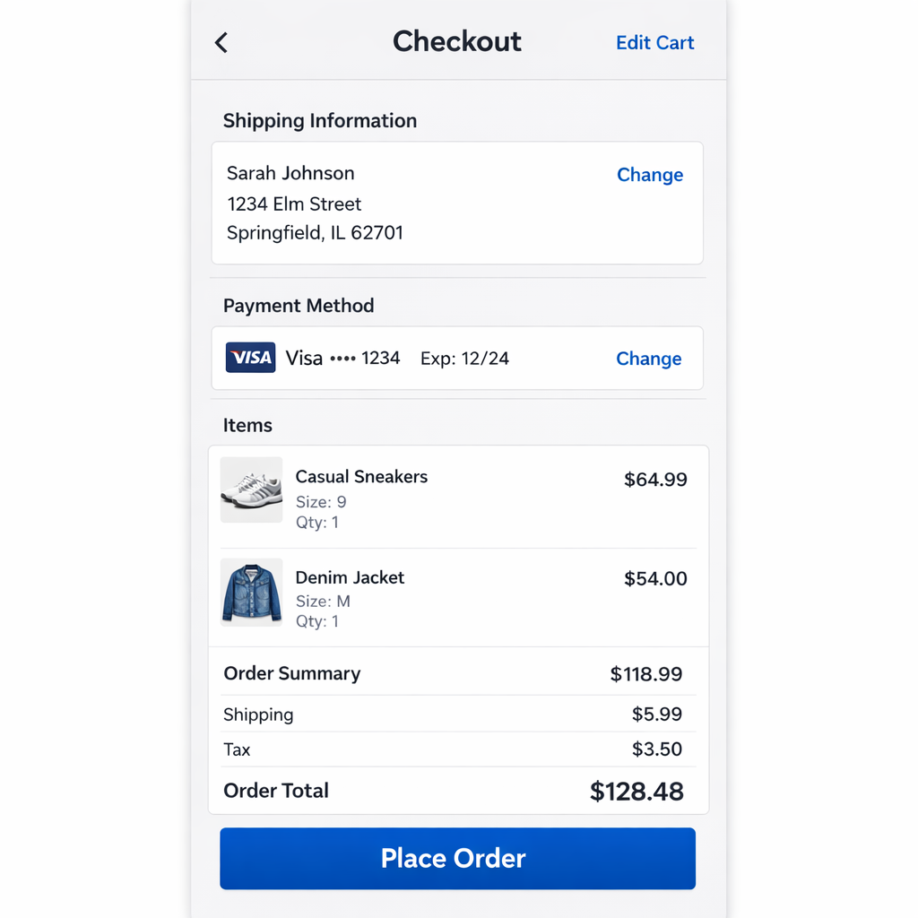
render_result_table(case=ui_case, result=ui_result, title="UI Mockup: Prompt vs. Scores")Criteria: The image clearly depicts a mobile checkout screen. All required sections are present and visually distinct. UI elements look clickable/editable and follow common conventions. Primary vs secondary actions are unambiguous. No extra UI states, decorative noise, or placeholder text.</pre><td style='text-align:left; padding:8px; vertical-align:top'><pre style='white-space:pre-wrap; word-break:break-word; margin:0'>in_image_text_rendering: True instruction_following: True layout_hierarchy: 5.0 ui_affordance_rendering: 5.0 verdict: PASS</pre></td><td style='text-align:left; padding:8px; vertical-align:top'><pre style='white-space:pre-wrap; word-break:break-word; margin:0'>All required text is present ("Checkout", "Edit Cart", "Place Order"). Screen clearly matches a mobile checkout/order review with distinct sections (Shipping Information, Payment Method, Items, Order Summary). Order Total appears directly above the primary CTA, and the "Place Order" button is the most visually prominent element. No popups, ads, marketing copy, or lorem/placeholder text. Text is crisp and readable with appropriate hierarchy. UI elements (back arrow, Edit Cart link, Change links, primary CTA) have clear, realistic affordances.</pre></td>
Marketing Graphics Generation
Marketing graphics are a “high-stakes text-to-image” workflow: the output is meant to ship (or at least be reviewed as if it could ship). A flyer can look “nice” but still fail if the copy is wrong, the offer is unclear, or the layout hides the key message.
This section shows how to evaluate flyer generation with a coffee shop example. The goal is to make evaluation workflow-relevant: can a marketer or designer use this output with minimal edits?
Example:

Why marketing graphics evals are different
Marketing images combine three hard problem types:
- Exact text requirements (gating)
- Layout + hierarchy (graded)
- Style + brand consistency (graded + optional human prefs)
Example task: Coffee shop flyer generation
- Scenario: a local coffee shop needs a promotional flyer for a limited-time drink and a weekday deal.
- Prompt guidance: be explicit about the deliverable, required copy, hierarchy, and disallowed extras.
- Implementation: the full prompt and criteria live in the harness setup code cell below (
coffee_generation_promptandcoffee_criteria).
What to evaluate (practical metrics):
Use a mix of gates (hard constraints) and graded signals (quality).
1) Instruction following — Pass / Fail (gate)
Marketing assets fail fast if they don’t match the spec.
PASS if
- Correct deliverable type: clearly a flyer/poster layout (not a UI screen, not a random photo).
- Required components exist (headline/subheadline/offer/CTA/footer + hero image).
FAIL if
- Missing any required component or the output is not recognizably a flyer.
2) Text rendering accuracy — Pass / Fail (gate)
This is usually the #1 production failure mode.
PASS if
- All required text strings are present and exactly correct (spelling, punctuation, capitalization, symbols).
- Text is readable (not smeared, clipped, warped, or overlapping).
FAIL if
- Any required text is incorrect/missing/unreadable, or any extra text appears.
Tip: if your workflow requires “exact copy,” treat this as a hard gate. Don’t average it away.
3) Layout and hierarchy — 0–5
Measures whether the flyer communicates clearly at a glance.
What to look for:
- Clear priority: headline dominates, subheadline supports, offer stands out, footer is secondary.
- Alignment and spacing feel intentional (no crowded clusters, no random floating elements).
- Read order is unambiguous.
4) Style and brand fit — 0–5
Measures whether it matches the requested “vibe” and avoids off-brand looks.
What to look for:
- Warm, cozy, minimal; specialty coffee visual language.
- Consistent palette and typography feel (not multiple conflicting styles).
- Avoids cartoonish illustration if the prompt requested photo-real.
5) Visual quality and artifact severity — 0–5
A flyer can be “correct” but still unusable if it’s visually broken.
What to look for:
- No distorted objects, broken hands/cups, melted foam textures, weird artifacts around text.
- Background texture is subtle (doesn’t compete with copy).
- Hero image looks appetizing and coherent.
6) Human feedback (quick and high leverage)
UI "usability clarity" is where humans add the most value. Keep it lightweight and focused on interaction intent.
- Rubric labels (fast):
- Would you use this mockup to iterate on a real product screen? (Y/N)
- If N, why? (missing section, action button unclear, text unreadable, layout confusing, etc.)
- Overall usability clarity: 1–5
- Common failure tags (for debugging + iteration):
wrong_screen_typemissing_required_sectionextra_ui_elementsprimary_cta_not_cleartext_unreadable_or_garbledaffordances_unclearlayout_confusing
Verdict rules (how to convert metrics into a single pass/fail)
A simple and strict set of rules works well:
- Instruction following must PASS
- Text rendering must PASS
- Layout and hierarchy ≥ 3
- Style and brand fit ≥ 3
- Visual quality ≥ 3
If any rule fails → overall FAIL.
(Do not average scores to override text correctness.)
Example TestCase set (small but high-signal)
Start with ~8–12 cases to cover common flyer variants and edge cases.
- Seasonal campaign (the “Winter Latte Week” prompt above)
- Minimal text (only 2 lines + logo + hours) — tests sparse layouts
- Dense info (menu highlights + deal + two CTAs) — tests hierarchy under load
- Strict no-extra-text — tests hallucinated filler copy
- Exact punctuation (“20% OFF • Mon–Thu”) — tests symbol fidelity
- Two offers (“BOGO Tuesdays” + “Happy Hour 2–4”) — tests multi-badge layout
- Colorway constraint (“use only cream + dark brown + muted orange”)
- Accessibility variant (high contrast, large text, simple background)
LLM-as-judge rubric prompt
Below is a judge prompt aligned to your existing LLMajRubricGrader. It returns structured metric scores + an overall verdict.
You can use this with your existing grader by changing the JSON schema to include the fields below (or create separate graders per metric if you prefer).
PROMPT = """<core_mission>
Evaluate whether a generated marketing flyer is usable for a real coffee shop
promotion by checking instruction adherence, exact text correctness, layout clarity,
style fit, and artifact severity.
</core_mission>

<role>
You are an expert evaluator of marketing design deliverables.
You care about correctness, readability, hierarchy, and brand-fit.
You do NOT reward creativity that violates constraints.
</role>

<scope_constraints>
- Judge ONLY against the provided prompt and criteria.
- Be strict about required copy: spelling, punctuation, casing, and symbols must match exactly.
- Extra or missing text is a serious error.
- If unsure, score conservatively (lower score).
</scope_constraints>

<metrics>
1) instruction_following: PASS/FAIL
2) text_rendering: PASS/FAIL
3) layout_hierarchy: 0-5
4) style_brand_fit: 0-5
5) visual_quality: 0-5

Use these anchors:
Layout/Hierarchy 5 = instantly readable; clear order; strong spacing/alignment.
3 = understandable but needs iteration (one clear issue).
0-2 = confusing or hard to parse.

Style/Brand Fit 5 = clearly matches requested vibe; consistent; not off-style.
3 = generally matches but with noticeable mismatch.
0-2 = wrong style (e.g. cartoonish when photo-real requested).

Visual Quality 5 = clean; no distracting artifacts; hero image coherent.
3 = minor artifacts but still usable.
0-2 = obvious artifacts or distortions that break usability.
</metrics>

<verdict_rules>
Overall verdict is FAIL if:
- instruction_following is FAIL, OR
- text_rendering is FAIL, OR
- any of layout_hierarchy/style_brand_fit/visual_quality is < 3.
Otherwise PASS.
</verdict_rules>

<output_constraints>
Return JSON only.
No extra text.
</output_constraints>
"""
Recommended JSON Output
{
  "verdict": "PASS",
  "instruction_following": True,
  "text_rendering": True,
  "layout_hierarchy": 4,
  "style_brand_fit": 4,
  "visual_quality": 3,
  "reason": "..."
}{'verdict': 'PASS',
'instruction_following': True,
'text_rendering': True,
'layout_hierarchy': 4,
'style_brand_fit': 4,
'visual_quality': 3,
'reason': '...'}Coffee Example: Harness Setup
Define a single marketing flyer test case, a model run, and an output store.
# Run the harness for a single coffee flyer generation case.

coffee_generation_prompt = """Create a print-ready vertical A4 flyer for a coffee shop called Sunrise Coffee.
Use a warm, cozy, minimal specialty coffee aesthetic (not cartoonish).
Required text (must be exact):
- WINTER LATTE WEEK
- Try our Cinnamon Oat Latte
- 20% OFF - Mon-Thu
- Order Ahead
- 123 Market St - 7am-6pm
Do not include any other words, prices, URLs, or QR codes.
"""

coffee_criteria = """All required text appears exactly as written and is legible.
Layout reads clearly: shop name -> headline -> subheadline -> offer -> CTA -> footer.
Style matches warm, cozy, specialty coffee and is not cartoonish.
No extra text, watermarks, or irrelevant UI-like elements."""

coffee_case = TestCase(
    id="coffee_flyer_generation",
    task_type="image_generation",
    prompt=coffee_generation_prompt,
    criteria=coffee_criteria,
)

coffee_run = ModelRun(
    label="gpt-image-1.5",
    task_type="image_generation",
    params={
        "model": "gpt-image-1.5",
        "n": 1,
        "size": "1024x1024",
    },
)

# Save artifacts under the repo images/ folder so they render on the site.
coffee_store = OutputStore(root=Path("../../images"))
Coffee Example: Run And Grade
Run the harness and score the output with the marketing judge rubric.
# Use the prebuilt graders + evaluate helpers with a structured marketing schema.
from openai import OpenAI

marketing_schema = {
    "type": "object",
    "properties": {
        "verdict": {"type": "string"},
        "instruction_following": {"type": "boolean"},
        "text_rendering": {"type": "boolean"},
        "layout_hierarchy": {"type": "number"},
        "style_brand_fit": {"type": "number"},
        "visual_quality": {"type": "number"},
        "reason": {"type": "string"},
    },
    "required": [
        "verdict",
        "instruction_following",
        "text_rendering",
        "layout_hierarchy",
        "style_brand_fit",
        "visual_quality",
        "reason",
    ],
    "additionalProperties": False,
}

def parse_marketing_result(data: dict, base_key: str) -> list[Score]:
    return [
        Score(key="instruction_following", value=bool(data["instruction_following"]), reason=""),
        Score(key="text_rendering", value=bool(data["text_rendering"]), reason=""),
        Score(key="layout_hierarchy", value=float(data["layout_hierarchy"]), reason=""),
        Score(key="style_brand_fit", value=float(data["style_brand_fit"]), reason=""),
        Score(key="visual_quality", value=float(data["visual_quality"]), reason=""),
        Score(key="verdict", value=str(data["verdict"]), reason=(data.get("reason") or "").strip()),
    ]

marketing_grader = LLMajRubricGrader(
    key="marketing_eval",
    system_prompt=PROMPT,
    content_builder=build_generation_judge_content,
    judge_model="gpt-5.2",
    json_schema_name="marketing_flyer_eval",
    json_schema=marketing_schema,
    result_parser=parse_marketing_result,
)

coffee_results = evaluate(
    cases=[coffee_case],
    model_runs=[coffee_run],
    graders=[marketing_grader],
    output_store=coffee_store,
)

coffee_result = coffee_results[0]

# Simple alternative: exact text-rendering check via OCR-style extraction.
REQUIRED_TEXT = {
    "WINTER LATTE WEEK",
    "Try our Cinnamon Oat Latte",
    "20% OFF • Mon–Thu",
    "Order Ahead",
    "123 Market St • 7am–6pm",
}

def extract_text_from_flyer(image_path: str | Path, model: str = "gpt-5.2") -> list[str]:
    judge_client = client if "client" in globals() else OpenAI()
    image_url = image_to_data_url(Path(image_path))

    instructions = (
        "List every piece of text visible in this flyer image. "
        "Return one line per text item and preserve capitalization, punctuation, and spacing exactly."
    )

    response = judge_client.responses.create(
        model=model,
        instructions=instructions,
        input=[
            {
                "role": "user",
                "content": [
                    {"type": "input_image", "image_url": image_url},
                ],
            }
        ],
    )

    return [line.strip() for line in (response.output_text or "").splitlines() if line.strip()]

coffee_image_path = Path(coffee_result["artifact_paths"][0])
extracted_lines = extract_text_from_flyer(coffee_image_path)

missing = sorted(REQUIRED_TEXT - set(extracted_lines))
extra = sorted(set(extracted_lines) - REQUIRED_TEXT)
text_rendering_pass = not missing and not extra

parts = []
if missing:
    parts.append("missing: " + ", ".join(missing))
if extra:
    parts.append("extra: " + ", ".join(extra))
text_rendering_reason = "; ".join(parts) if parts else "Exact text match."

# Keep both: the judge's text_rendering and the OCR exact-match result.
text_rendering_judge_score = coffee_result["scores"].get("text_rendering")
text_rendering_judge_reason = coffee_result["reasons"].get("text_rendering", "")

coffee_result["scores"]["text_rendering_judge"] = text_rendering_judge_score
coffee_result["reasons"]["text_rendering_judge"] = text_rendering_judge_reason

coffee_result["scores"]["text_rendering_ocr"] = text_rendering_pass
coffee_result["reasons"]["text_rendering_ocr"] = text_rendering_reason

coffee_result{'test_id': 'coffee_flyer_generation',
'model_label': 'gpt-image-1.5',
'task_type': 'image_generation',
'artifact_paths': ['/cookbook/assets/images/gen_coffee_flyer_generation_gpt-image-1.5_1769657762450_0.png'],
'scores': {'instruction_following': True,
'text_rendering': True,
'layout_hierarchy': 5.0,
'style_brand_fit': 5.0,
'visual_quality': 5.0,
'verdict': 'PASS',
'text_rendering_judge': True,
'text_rendering_ocr': False},
'reasons': {'instruction_following': '',
'text_rendering': '',
'layout_hierarchy': '',
'style_brand_fit': '',
'visual_quality': '',
'verdict': 'All required lines appear and match exactly (including casing, hyphen/en-dash, and punctuation), with no extra words, prices, URLs, or QR codes. Text is crisp and legible. Hierarchy follows the requested order: shop name at top, then headline, subheadline, offer, CTA, and footer address/hours. Visual style is warm, cozy, minimal specialty coffee with a realistic latte photo (not cartoonish). No visible watermarks, UI elements, or distracting artifacts; overall print-flyer quality is clean.',
'text_rendering_judge': '',
'text_rendering_ocr': 'missing: 123 Market St • 7am–6pm, 20% OFF • Mon–Thu; extra: 123 Market St - 7am-6pm, 20% OFF - Mon-Thu, SUNRISE COFFEE'},
'run_params': {'model': 'gpt-image-1.5', 'n': 1, 'size': '1024x1024'}}Flyer Generation Results
Render the generated image, prompt, and scores side by side.
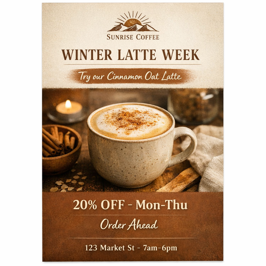
render_result_table(case=coffee_case, result=coffee_result, title="Coffee Flyer: Prompt vs. Scores")Criteria: All required text appears exactly as written and is legible. Layout reads clearly: shop name -> headline -> subheadline -> offer -> CTA -> footer. Style matches warm, cozy, specialty coffee and is not cartoonish. No extra text, watermarks, or irrelevant UI-like elements.</pre><td style='text-align:left; padding:8px; vertical-align:top'><pre style='white-space:pre-wrap; word-break:break-word; margin:0'>instruction_following: True layout_hierarchy: 5.0 style_brand_fit: 5.0 text_rendering: True text_rendering_judge: True text_rendering_ocr: False verdict: PASS visual_quality: 5.0</pre></td><td style='text-align:left; padding:8px; vertical-align:top'><pre style='white-space:pre-wrap; word-break:break-word; margin:0'>All required lines appear and match exactly (including casing, hyphen/en-dash, and punctuation), with no extra words, prices, URLs, or QR codes. Text is crisp and legible. Hierarchy follows the requested order: shop name at top, then headline, subheadline, offer, CTA, and footer address/hours. Visual style is warm, cozy, minimal specialty coffee with a realistic latte photo (not cartoonish). No visible watermarks, UI elements, or distracting artifacts; overall print-flyer quality is clean.</pre></td>
Additional Method: Image-to-Text + Text Comparison
Another evaluation approach is to shift the problem into a different modality—text. In this setup, images are first converted into a verbose textual description using a vision model, and evaluations are then performed by comparing the generated text against the expected text.
This method works particularly well for OCR-style workflows. For example, you can extract text from a generated flyer using a vision model and then compare the resulting text lines directly against the required copy set to verify correctness and completeness.
import pandas as pd

coffee_image_path = Path(coffee_result["artifact_paths"][0])
extracted_lines = extract_text_from_flyer(coffee_image_path)

required_lines = sorted(REQUIRED_TEXT)
required_set = set(required_lines)
extracted_set = set(extracted_lines)

missing = sorted(required_set - extracted_set)
extra = sorted(extracted_set - required_set)

text_rendering_df = pd.DataFrame(
    {
        "text_rendering_score": [coffee_result["scores"].get("text_rendering")],
        "missing_text": ["\n".join(missing) or "(none)"],
        "extra_text": ["\n".join(extra) or "(none)"],
        "extracted_text": ["\n".join(extracted_lines) or "(no text extracted)"],
    }
)

text_rendering_df| text_rendering_score | missing_text | extra_text | extracted_text | |
|---|---|---|---|---|
| 0 | True | 123 Market St • 7am–6pm\n20% OFF • Mon–Thu | 123 Market St - 7am-6pm\n123 Market St - 7am-6... | SUNRISE COFFEE\nWINTER LATTE WEEK\nTry our Cin... |